
7 Episodes · 2h34min
- Custom Button Styles 14:28
- Self-Sizing Buttons 25:24
- Adding the Data Model 27:27
- Lap Times 21:50
- Analog Clock 22:24
- Analog Clock (Part 2) 23:48
- Scaling Text to Fit 18:50
Swift Talk # 180
Subscribers get exclusive access to new and all previous subscriber-only episodes, video downloads, and 30% discount for team members. Become a Subscriber →
We use a custom button style to imitate the appearance of the stopwatch buttons on iOS.
00:06 Today we'll start working on something new and try to rebuild parts of the Clock app's stopwatch screen in SwiftUI. This interface will be less interactive and animation heavy than the shopping cart we were working on in the past few episodes, but it will come with its own challenges.
00:30 The first thing we'll do is try to build the circle-shaped buttons that start, stop, and reset the stopwatch.
00:50 We create a text with a circle as its background:
struct ContentView: View {
    var body: some View {
        Text("Hello, World!")
            .foregroundColor(.white)
            .background(
                Circle()
                    .fill(Color.green)
            )
    }
}
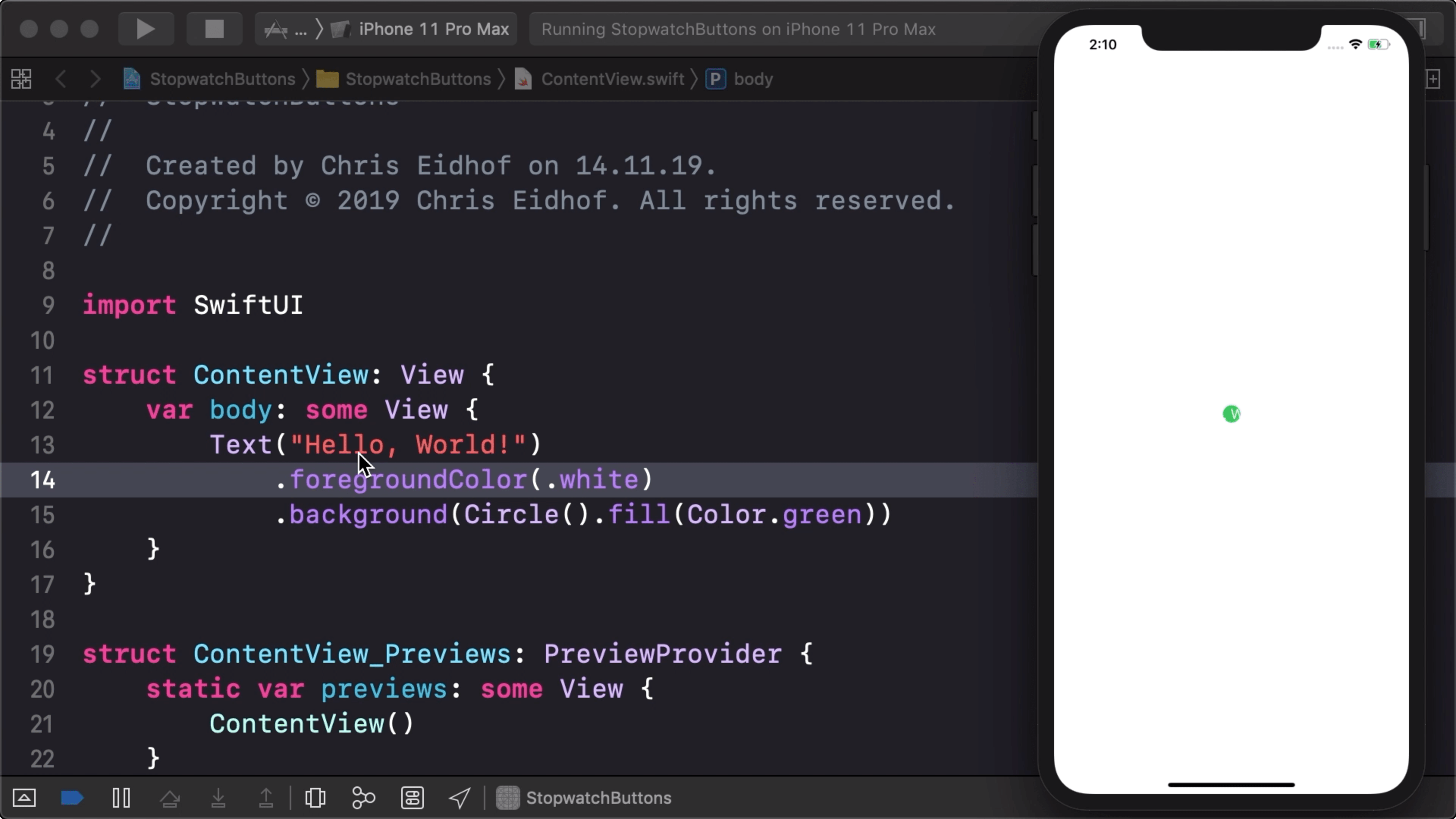
01:25 When we run this, we see a tiny circle behind the text. To
understand why this happens, we need to look at how the layout system works.
First, the layout system proposes the entire screen to the Text view as
available space. The Text view then lays itself out as a label with a single
line of text, which is centered onscreen. Then, the background view receives the
frame of the label as the available space for its contents, and the circle draws
itself to fit within this frame.
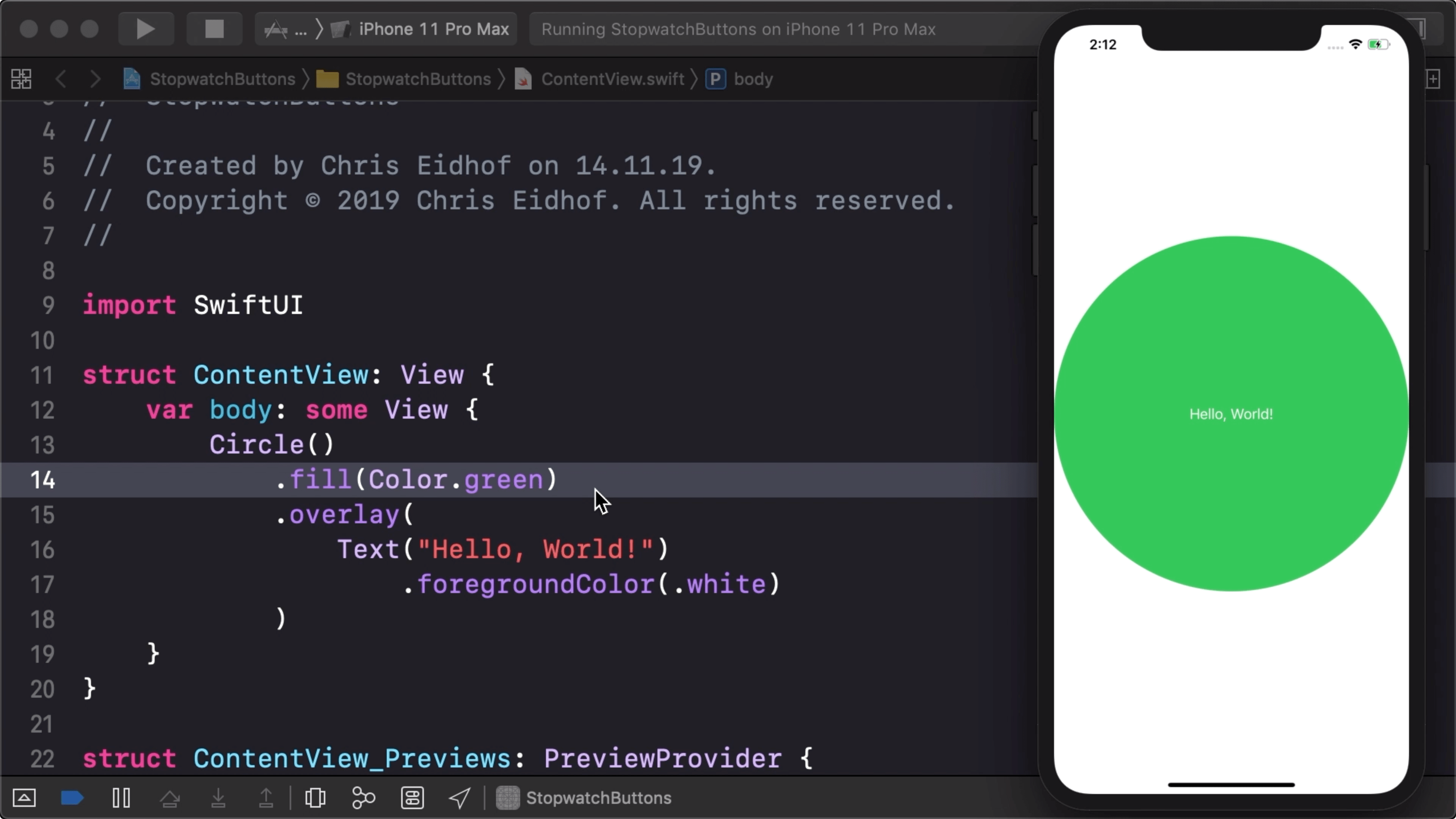
02:25 But we want it the other way around: the circle has to be at least as large as the entire text label. So instead of the above setup, let's place the text in an overlay of the circle:
struct ContentView: View {
    var body: some View {
        Circle()
            .fill(Color.green)
            .overlay(
                Text("Hello, World!")
                    .foregroundColor(.white)
            )
    }
}
03:25 Now the circle is the first view that can fill up the available space — the entire screen in this case — and then the label gets the opportunity to lay itself out within the circle's frame:
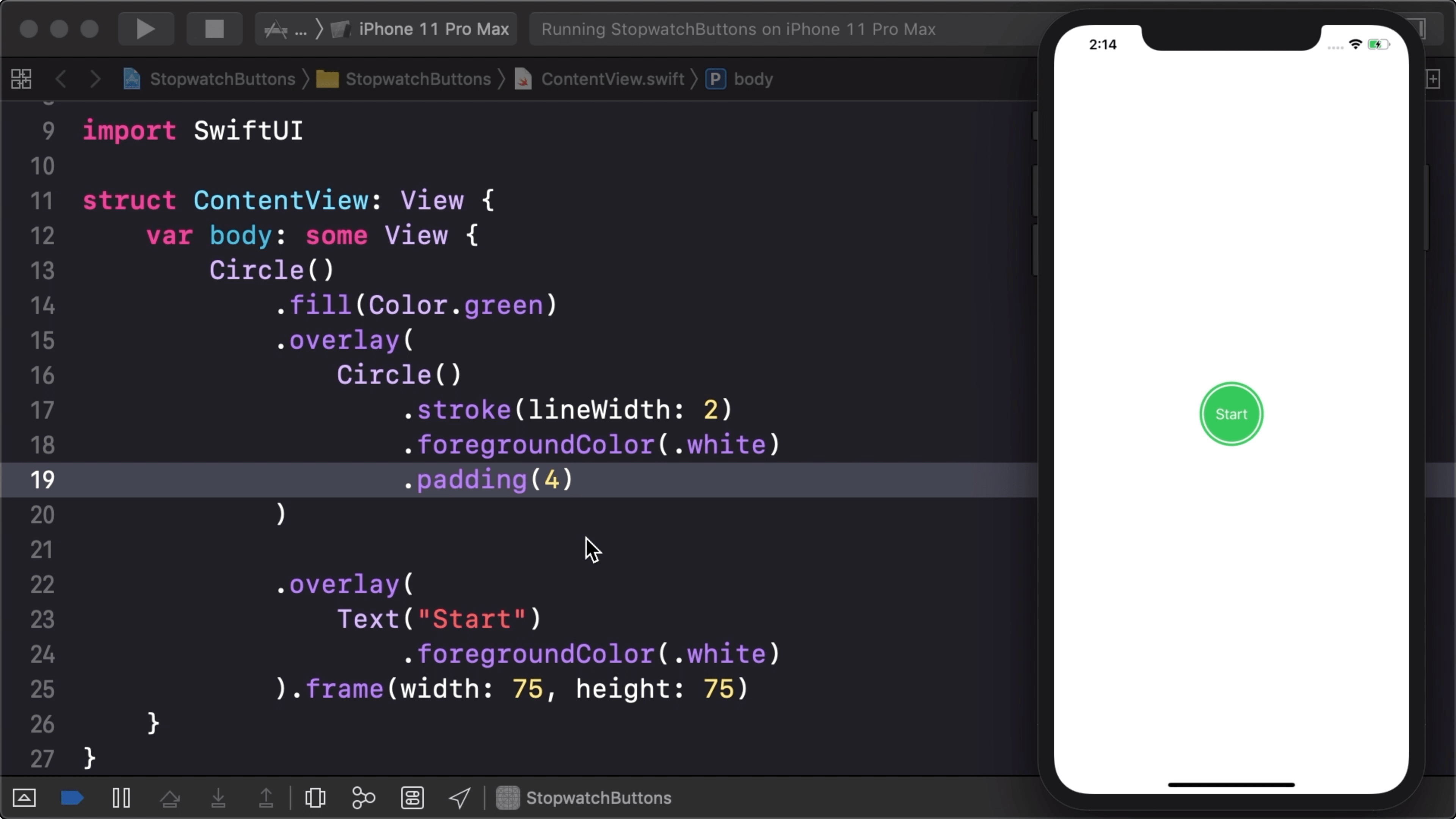
03:38 We can set an explicit frame size on the circle, which works well for the specific label text we want:
struct ContentView: View {
    var body: some View {
        Circle()
            .fill(Color.green)
            .overlay(
                Text("Start")
                    .foregroundColor(.white)
            )
            .frame(width: 75, height: 75)
    }
}
04:04 Later on, we'll remove the explicit size and make the button self-sizing. That way, the button will also work with other labels and localizations.
04:29 There's one more design detail missing: the buttons in the Clock app also have a white border just inside the circle's outer radius. So, in another overlay, we add a stroked circle with some padding:
struct ContentView: View {
    var body: some View {
        Circle()
            .fill(Color.green)
            .overlay(
                Circle()
                    .stroke(lineWidth: 2)
                    .foregroundColor(.white)
                    .padding(4)
            )
            .overlay(
                Text("Start")
                    .foregroundColor(.white)
            )
            .frame(width: 75, height: 75)
    }
}
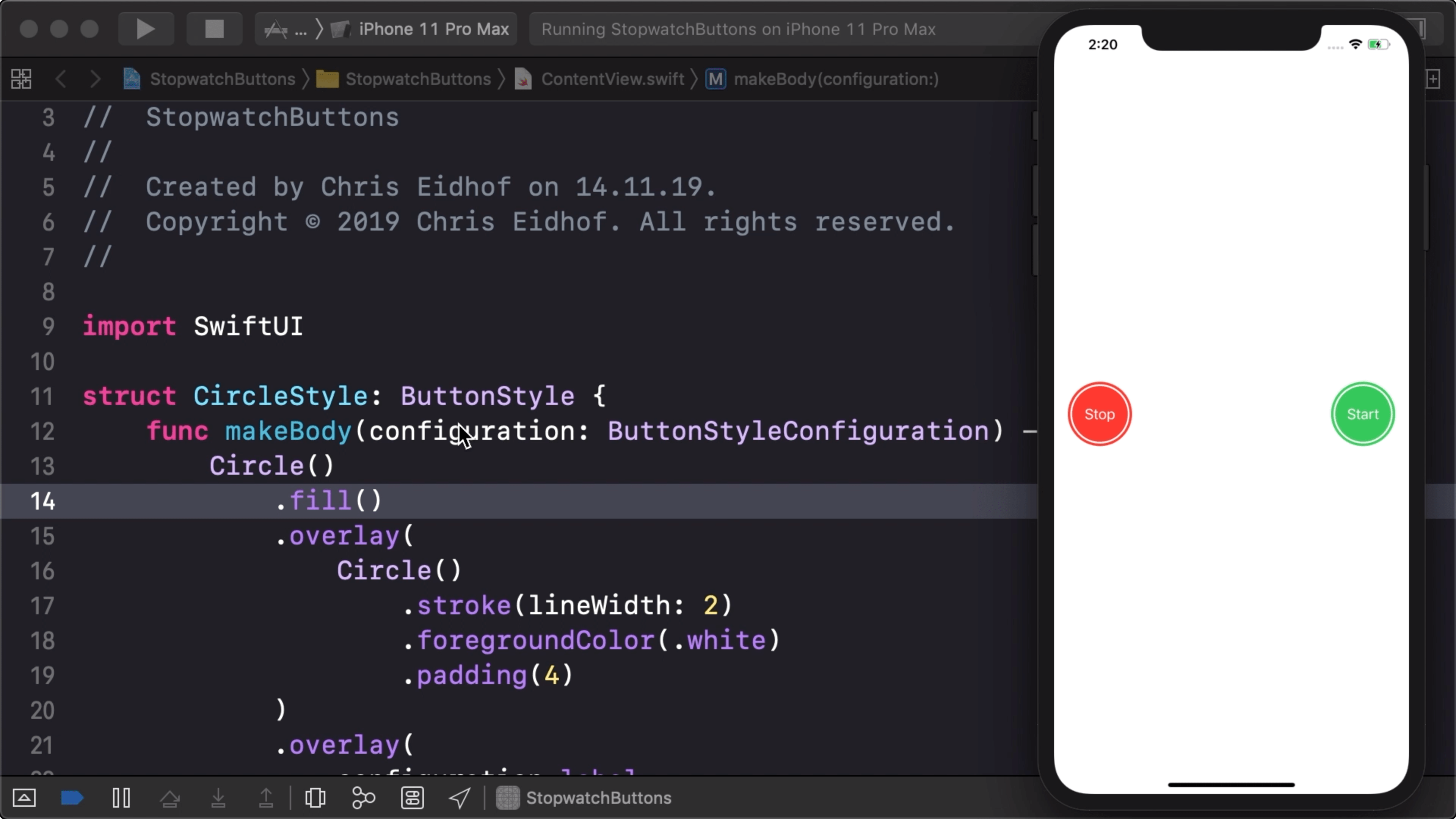
05:55 Right now, we don't have a button, but rather a view. And eventually, we'll want to have more than one of these buttons, so it makes sense to take our current code and turn it into a button style that can be reused.
06:33 We create a button style by writing a struct that conforms to the
ButtonStyle protocol, meaning it has to implement the
makeBody(configuration:) function. From this function, we return the view we
just wrote, replacing the hardcoded Text("Start") with the Label view that
is provided by the configuration argument:
struct CircleStyle: ButtonStyle {
    func makeBody(configuration: ButtonStyleConfiguration) -> some View {
        Circle()
            .fill(Color.green)
            .overlay(
                Circle()
                    .stroke(lineWidth: 2)
                    .foregroundColor(.white)
                    .padding(4)
            )
            .overlay(
                configuration.label
                    .foregroundColor(.white)
            )
            .frame(width: 75, height: 75)
    }
}
07:59 Then we can create a button using this style:
struct ContentView: View {
    var body: some View {
        Button(action: {}) {
            Text("Start")
        }
        .buttonStyle(CircleStyle())
        .frame(width: 75, height: 75)
    }
}
09:01 Let's add a second button by copying the first one. Thanks to the
environment system, we can set the button style on the enclosing HStack and
have it applied on both buttons:
struct ContentView: View {
    var body: some View {
        HStack {
            Button(action: {}) {
                Text("Stop")
            }
            .frame(width: 75, height: 75)

            Button(action: {}) {
                Text("Start")
            }
            .frame(width: 75, height: 75)
        }
        .buttonStyle(CircleStyle())
    }
}
09:58 It's nice that we can apply our button style once instead of repeating it for each individual button. But the problem is that both buttons are green and we want the stop button to be red.
10:53 The environment system also solves this problem, because we can
set each button's color by applying the foregroundColor modifier. We also add
a spacer between the buttons and some padding around them:
struct ContentView: View {
    var body: some View {
        HStack {
            Button(action: {}) {
                Text("Stop")
            }
            .foregroundColor(.red)
            .frame(width: 75, height: 75)

            Spacer()

            Button(action: {}) {
                Text("Start")
            }
            .foregroundColor(.green)
            .frame(width: 75, height: 75)
        }
        .padding()
        .buttonStyle(CircleStyle())
    }
}
11:30 Inside the button style, we no longer use a specific color to
fill the circle, but rather we default to the foreground color from the
environment:
struct CircleStyle: ButtonStyle {
    func makeBody(configuration: ButtonStyleConfiguration) -> some View {
        Circle()
            .fill()
            .overlay(
                Circle()
                    .stroke(lineWidth: 2)
                    .foregroundColor(.white)
                    .padding(4)
            )
            .overlay(
                configuration.label
                    .foregroundColor(.white)
            )
            .frame(width: 75, height: 75)
    }
}
11:48 We should also show some feedback when the button is being
pressed. The button-style configuration has a property for this state:
isPressed.
We don't know which color will be used to fill the button, so in order to
lighten up the button when it gets pressed, we add another overlay with a white,
transparent circle whose opacity is dependent on the isPressed property of the
style configuration:
struct CircleStyle: ButtonStyle {
    func makeBody(configuration: ButtonStyleConfiguration) -> some View {
        Circle()
            .fill()
            .overlay(
                Circle()
                    .fill(Color.white)
                    .opacity(configuration.isPressed ? 0.3 : 0)
            )
            .overlay(
                Circle()
                    .stroke(lineWidth: 2)
                    .foregroundColor(.white)
                    .padding(4)
            )
            .overlay(
                configuration.label
                    .foregroundColor(.white)
            )
    }
}
13:18 The ButtonStyle protocol works similarly to the ViewModifier
protocol, except it's specialized for buttons because it takes properties like
isPressed into account. And it's nice how it works together with the
environment system.
13:44 The next step will be to configure our button in such a way that we can use any label size and the button will adjust its size to fit around the label. On top of that, we want a few of these buttons to take on the same size as the largest one. We'll continue with these steps next week.
Written in Swift 5
Become a subscriber to download episode videos.
7 Episodes · 2h34min
Episode 499 · Jul 10
Episode 498 · Jul 03
Episode 497 · Jun 26
Episode 496 · Jun 19
Episode 495 · Jun 12
Episode 494 · Jun 05
Episode 493 · May 29
Episode 492 · May 15
Unlock Full Access
A new episode every week
Take Swift Talk with you when you're offline
With your help we can keep producing new episodes