00:06 Today we're starting a new series in which we build a layout
library. Defining a layout on iOS used to be very easy years ago when there was
only one device size of 320 points wide and every app was always presented
fullscreen. But now we have to deal with a ton of different situations.
00:43 Our apps can appear on many different physical screen sizes (which
can be rotated to landscape or portrait), but also in various contexts that come
with their own size variations, such as multitasking on iPad. Within all these
frame variations, our app also has to react to different user-defined font sizes
and locale-specific differences in formatting. Lastly, there's content that we
don't always control but have to lay out fittingly.
Simple Example
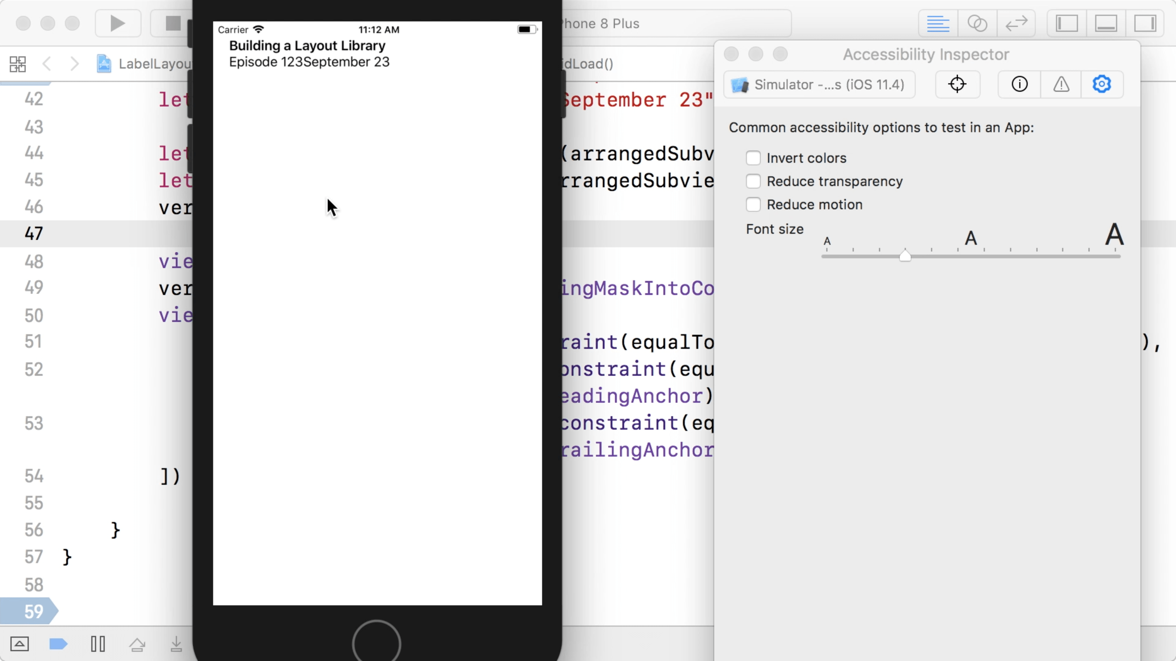
01:49 We've built a simple example app with a title label on top. Below
that is some metadata in the form of labels describing the episode number and a
date:
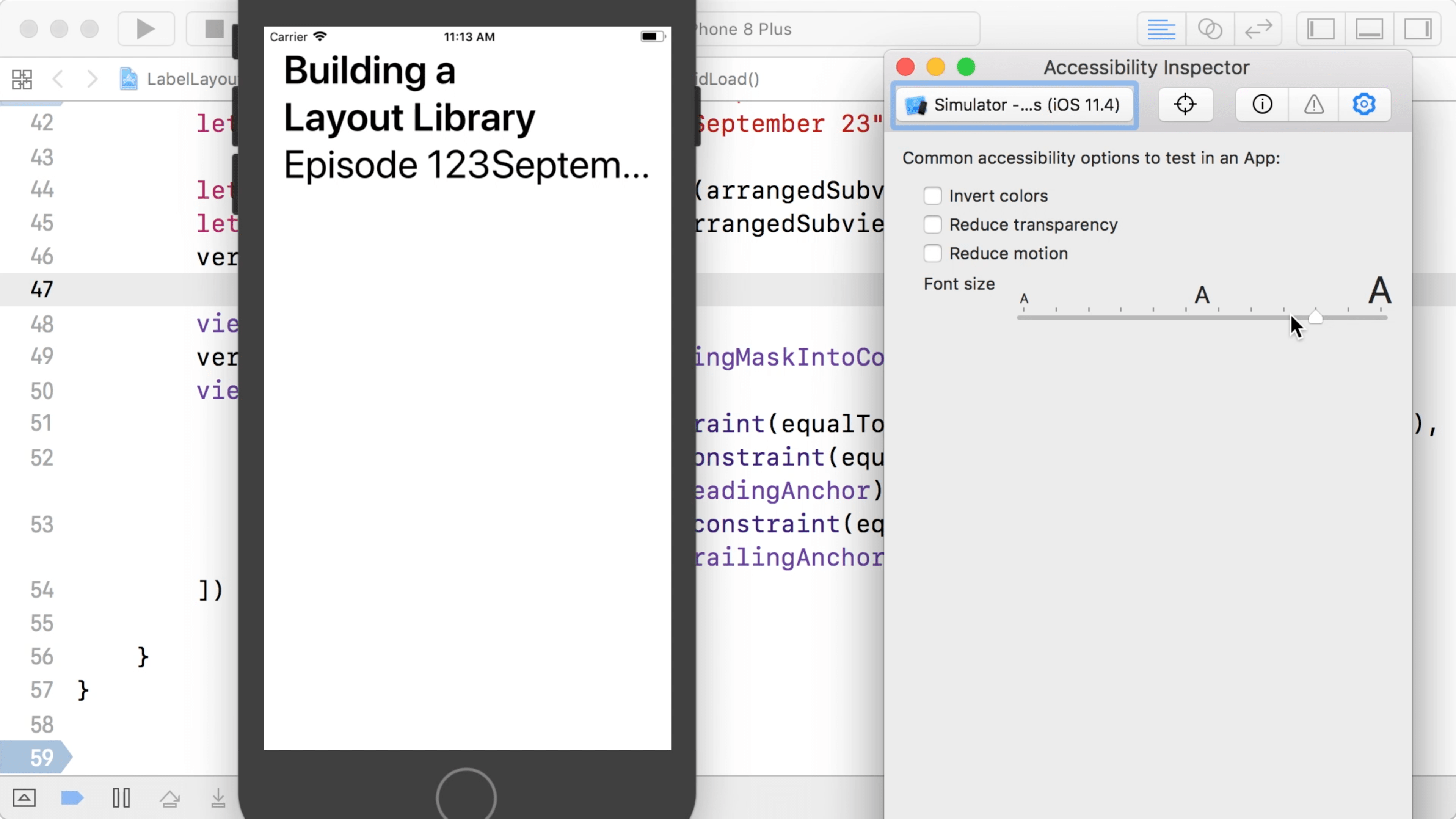
02:06 From the Xcode menu, we can open the accessibility inspector and
use it to dynamically change the font size in order to see how the layout is
affected when the user sets a preferred font size through the accessibility
settings.
02:17 As we increase the font size, we see that at some point, not all
text fits on the screen, so some labels get truncated. The title label doesn't
have this problem because it's set up to wrap its text over multiple lines. But
the episode number and date labels are laid out next to each other on one line
and they're configured to show a single line of text.
03:08 A quick workaround in this case would be to put the number and
date in a single label and let it span multiple lines as well. But that's not a
solution that works for every UI design. It would make more sense to make our
layout responsive by positioning the two labels below each other if they don't
fit on a single line.
03:27 Implementing this alternate layout with the built-in tools isn't
very easy. We use Auto Layout constraints to lay out the subviews, which means
we now have to use two sets of constraints, check if everything fits in the
layout defined by the first set of constraints, and if not, switch to the other
set. Our goal is to build a layer of abstraction in which we can express all of
this in a declarative way.
Flight Status Example
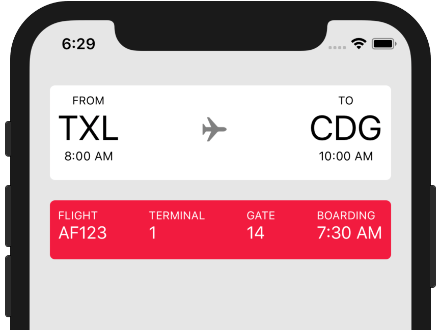
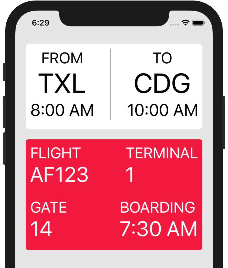
04:13 In order to get a sense of what the library can do for us, let's
take a sneak peek at a more complicated example that already uses the library
we're going to build. This app shows information about a flight. On top we see
the origin and destination airports with an airplane icon between them, along
with other details about the flight below:
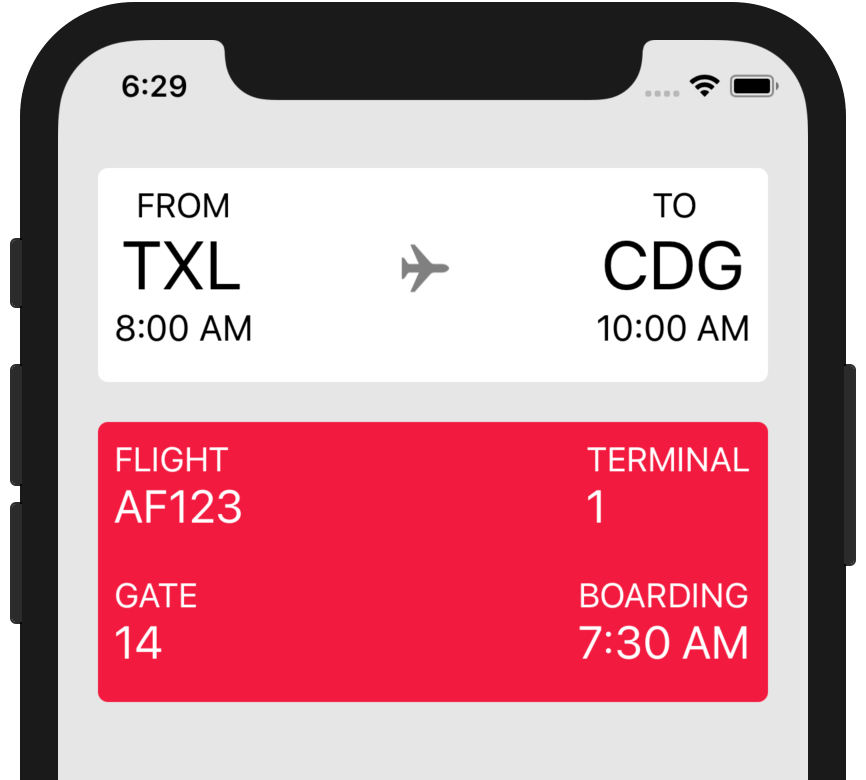
04:41 When we increase the font size using the accessibility inspector,
we see that the block of detail information switches to a 2x2 grid layout when
it no longer fits in one row:
05:24 By increasing the font size even further, the airport info on top
gets too tight, so the airplane icon is replaced by a thin line:
05:34 Even this layout no longer fits when we select the largest
possible font size, so we switch to a vertical layout of the airports:
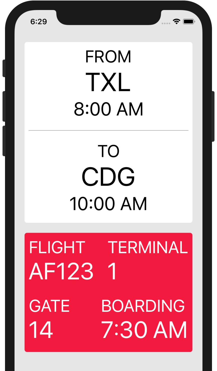
05:43 When we rotate the phone, the original layout comes back because
it fits again. The way the library chooses a layout variation is completely
dependent on whether or not things fit within the width of the root view's
bounds. If the library runs out of options and none of the layout alternatives
fit, it'll just use the last one.
Layout Abstraction
06:12 Today's challenge is to take the first example with the three
labels and build our library so that we can make the app switch from a
horizontal to vertical layout, thus avoiding text being truncated.
06:29 We've set up a draft of the UI using two nested stack views:
class ViewController: UIViewController {
    override func viewDidLoad() {
        super.viewDidLoad()

        let titleLabel = UILabel(text: "Building a Layout Library", size: .headline, multiline: true)
        let episodeNumber = UILabel(text: "Episode 123", size: .body)
        let episodeDate = UILabel(text: "September 23", size: .body)

        let horizontalStack = UIStackView(arrangedSubviews: [episodeNumber, episodeDate])
        let verticalStack = UIStackView(arrangedSubviews: [titleLabel, horizontalStack])
        verticalStack.axis = .vertical

        view.addSubview(verticalStack)
        verticalStack.translatesAutoresizingMaskIntoConstraints = false
        view.addConstraints([
            verticalStack.topAnchor.constraint(equalTo: view.layoutMarginsGuide.topAnchor),
            verticalStack.leadingAnchor.constraint(equalTo: view.layoutMarginsGuide.leadingAnchor),
            verticalStack.trailingAnchor.constraint(equalTo: view.layoutMarginsGuide.trailingAnchor),
        ])
    }
}
06:46 But now we want to replace the usage of the stack views with our
own layout implementation. Basically, we can define a layout as being either a
single view, two views next to each other, two views below each other, or — most
importantly — a choice between two layouts, where the library can apply the
first one that fits.
07:19 Let's try to express this in code. The Layout enum is almost
structured like a linked list, but with the additional feature of splitting into
two branches by including the choice case. Because the enum is recursive
(using its own type as an associated value) we have to mark it as indirect:
indirect enum Layout {
    case view(UIView, Layout)
    case newline(Layout)
    case choice(Layout, Layout)
    case empty
}
08:03 The view case describes a single UIView, which is followed on
the same line by the rest of the layout elements. The newline case allows us
to make a vertical layout. With these two cases, we can basically make a flow
layout, similar to how text is laid out: after each view, we can place another
view next to it or wrap to the next line and continue there.
08:37 The choice case is the special one that lets us define two
layout variations, and the library will pick the first one that fits in a given
width. The empty case ends our layout.
Defining a Layout
09:42 We can now try to build up our sample layout using enum values:
let layout = Layout.view(titleLabel, .newline(
    Layout.view(episodeNumber, Layout.view(episodeDate, .empty))
    ))
10:56 This defines a fixed layout with the number and date labels next
to each other. To express a variation, we pull the contents from the newline
case out into a local variable, call it horizontal, and define a vertical
variation of the same elements. Then we can add a choice case, which holds
both the horizontal and the vertical variation. We put horizontal as the first
option, because that's the one we prefer if it fits on the screen:
let horizontal = Layout.view(episodeNumber, Layout.view(episodeDate, .empty))
let vertical = Layout.view(episodeNumber, .newline(Layout.view(episodeDate, .empty)))
let layout = Layout.view(titleLabel, .newline(
    .choice(horizontal, vertical)
    ))
11:50 It's a bit complicated to write a layout this way, but we'll
improve the syntax later on.
Applying the Layout
11:56 Next, we need an algorithm that calculates frames for all views in
a Layout. We also need a container view that holds the views as subviews and
observes changes in font size in order to recalculate the layout.
12:18 We write a container view that takes a Layout. The container
view's layoutSubviews method is where we have to call a method on Layout
that calculates the views' frames and returns the views so that we can add them
as subviews:
final class LayoutContainer: UIView {
let layout: Layout
init(_ layout: Layout) {
self.layout = layout
super.init(frame: .zero)
}
required init?(coder aDecoder: NSCoder) {
fatalError("init(coder:) has not been implemented")
}
override func layoutSubviews() {
}
}
14:12 We start writing a method on Layout that calculates the frames
of its views based on the available width in the container view. We go through
the layout's views and assign frames, and as we do so, we collect the views in
an array we can return to the container view:
extension Layout {
func apply(containerWidth: CGFloat) -> [UIView] {
var result: [UIView] = []
}
}
15:19 Since we're in an enum, the only thing we can really do now is
switch on it. We let Xcode add all cases to the switch statement and we first
implement the view case.
In this case, we have to do a few things. We're laying out the UIView
contained in the view case, so we need to add it to the result array. We also
have to set the view's frame, for which we need an origin and a size. We create
a current origin, which we'll update as we go through the entire layout. Then we
ask the view for the size that fits within the available width. Finally, we
increase the current origin's x with the view's width:
extension Layout {
func apply(containerWidth: CGFloat) -> [UIView] {
var result: [UIView] = []
var origin: CGPoint = .zero
switch self {
case let .view(v, rest):
result.append(v)
let availableWidth = containerWidth - origin.x
let size = v.sizeThatFits(CGSize(width: availableWidth, height: .greatestFiniteMagnitude))
v.frame = CGRect(origin: origin, size: size)
origin.x += size.width
}
}
}
18:00 Then we have to continue applying the rest of the layout. We
could call apply recursively, but it's easier to store a current Layout
value and wrap the switch statement in a loop that keeps processing the current
layout value until we encounter the empty case:
extension Layout {
func apply(containerWidth: CGFloat) -> [UIView] {
var result: [UIView] = []
var origin: CGPoint = .zero
var current: Layout = self
while true {
switch current {
case let .view(v, rest):
result.append(v)
let availableWidth = containerWidth - origin.x
let size = v.sizeThatFits(CGSize(width: availableWidth, height: .greatestFiniteMagnitude))
v.frame = CGRect(origin: origin, size: size)
origin.x += size.width
current = rest
case .empty:
return result
}
}
}
}
19:10 The newline case is simpler, because we only have to set the
current origin's x back to 0, and we have to advance its y by the height
of the line we're now ending. To calculate this height, we add a variable,
lineHeight, outside the loop, and we set it to the height of the tallest view
we encounter until we start a new line:
extension Layout {
func apply(containerWidth: CGFloat) -> [UIView] {
var result: [UIView] = []
var origin: CGPoint = .zero
var current: Layout = self
var lineHeight: CGFloat = 0
while true {
switch current {
case let .view(v, rest):
lineHeight = max(lineHeight, size.height)
origin.x += size.width
current = rest
case let .newline(rest):
origin.x = 0
origin.y += lineHeight
lineHeight = 0
current = rest
}
}
}
21:15 In the choice case, we simply set current to the first option
for now. We'll come back to this after we implement the calculations we need to
actually choose the correct option:
extension Layout {
func apply(containerWidth: CGFloat) -> [UIView] {
var result: [UIView] = []
var origin: CGPoint = .zero
var current: Layout = self
var lineHeight: CGFloat = 0
while true {
switch current {
case let .choice(first, second):
current = first }
}
}
21:41 In the container view's layoutSubviews, we can now call the
layout's apply method to retrieve the views we need to add as subviews. We
wrote a helper function, setSubviews, that does a pointer comparison to
determine which views actually need to be added and which existing subviews need
to be removed:
final class LayoutContainer: UIView {
let layout: Layout
override func layoutSubviews() {
let views = layout.apply(containerWidth: bounds.width)
setSubviews(views)
}
}
22:49 We create a container view with our sample layout in the view
controller, replacing the stack views from before:
class ViewController: UIViewController {
override func viewDidLoad() {
super.viewDidLoad()
let layout = Layout.view(titleLabel, .newline(
.choice(horizontal, vertical)
))
let container = LayoutContainer(layout)
container.translatesAutoresizingMaskIntoConstraints = false
view.addSubview(container)
view.addConstraints([
container.topAnchor.constraint(equalTo: view.layoutMarginsGuide.topAnchor),
container.leadingAnchor.constraint(equalTo: view.layoutMarginsGuide.leadingAnchor),
container.trailingAnchor.constraint(equalTo: view.layoutMarginsGuide.trailingAnchor),
])
}
}
Updating the Layout
23:51 We run the app and see that our layout is applied. However, if we
bring up the accessibility inspector again and increase the font size, we notice
that the labels' frames aren't updated correctly.
We fix this by making the container view call setNeedsLayout — this tells the
system to call our layoutSubviews method — when it observes the notification
about changes to the font size. We don't have to worry about removing this
observer, since it's a selector-based version:
final class LayoutContainer: UIView {
let layout: Layout
init(_ layout: Layout) {
self.layout = layout
super.init(frame: .zero)
NotificationCenter.default.addObserver(self, selector: #selector(setNeedsLayout), name: Notification.Name.UIContentSizeCategoryDidChange, object: nil)
}
}
25:05 The labels now get updated when the preferred font size changes,
but we're not yet switching to the vertical layout variation when the text
doesn't fit on the screen.
Choosing between Layout Options
25:37 In order to choose a layout from the two options in choice, we
only have to know whether the first option fits. Otherwise, we choose the second
option. This means that if no fitting option is provided, we can still end up
with a layout that overflows.
26:05 We want to call a Layout.fits method that returns true if it
fits with the current x and the containerWidth. We need to pass both
variables to the fits method and not just the available space on the current
line, because the layout in question might include a newline, for which it
needs all the necessary information:
extension Layout {
func apply(containerWidth: CGFloat) -> [UIView] {
var origin: CGPoint = .zero
var current: Layout = self
while true {
switch current {
case let .choice(first, second):
if first.fits(currentX: origin.x, containerWidth: containerWidth) {
current = first
} else {
current = second
}
}
}
}
27:06 The implementation of fits is very similar to what we did in
apply. For now, what's easiest is to just copy the code, and later on we'll
see how we can remove the duplication. To check if a layout fits, we don't care
about the vertical dimension; we're only checking whether the layout fits
horizontally inside the container width. So instead of keeping track of an
origin point, we just have to keep track of a current x value:
extension Layout {
func fits(currentX: CGFloat, containerWidth: CGFloat) -> Bool {
var x = currentX
var current: Layout = self
while true {
switch current {
}
}
}
}
28:08 In the view case, we're not setting any frames; we simply
advance x by the view's width. We can return false if we've exceeded the
available width after doing so:
extension Layout {
func fits(currentX: CGFloat, containerWidth: CGFloat) -> Bool {
var x = currentX
var current: Layout = self
while true {
switch current {
case let .view(v, rest):
let availableWidth = containerWidth - x
let size = v.sizeThatFits(CGSize(width: availableWidth, height: .greatestFiniteMagnitude))
x += size.width
if x >= containerWidth { return false }
current = rest
}
}
}
}
29:00 In the newline case, we just have to set x back to zero:
extension Layout {
func fits(currentX: CGFloat, containerWidth: CGFloat) -> Bool {
var x = currentX
var current: Layout = self
while true {
switch current {
case let .newline(rest):
x = 0
current = rest
}
}
}
}
29:15 In the choice case, we have to call ourselves recursively to
check if the first option fits, and we return true if so. Otherwise, we
continue with the second option:
extension Layout {
func fits(currentX: CGFloat, containerWidth: CGFloat) -> Bool {
var x = currentX
var current: Layout = self
while true {
switch current {
case let .choice(first, second):
if first.fits(currentX: x, containerWidth: containerWidth) {
return true
} else {
current = second
}
}
}
}
}
29:40 We're doing some double work at this point by asking UIKit to do
a lot of sizeThatFits calculations just to see whether a view fits, throwing
away the computed sizes, and then repeating these calculations in order to
actually set the frames. But we'll improve this logic later.
30:06 Finally, the empty case always fits:
extension Layout {
func fits(currentX: CGFloat, containerWidth: CGFloat) -> Bool {
var x = currentX
var current: Layout = self
while true {
switch current {
case .empty:
return true
}
}
}
}
Results
30:13 We run the app and see that our layout now correctly switches to
the vertical variation if the horizontal one stops fitting on the screen because
we increase the font size. When we rotate the device, making the horizontal
variation fit again, the layout switches back correctly.
30:41 It's easy to see how we can also use this technique to optimize
our layout in multitasking mode on iPad, where the app can appear in various
sizes.
30:52 Basically, we now wrote the minimum version of the layout
library. Next time, we'll implement the flight status example app while adding
more features, helpers, and optimizations to the library. In the end, it should
be a really useful tool.
